Today Monkey and I are auditioning 3 fabrics and sharing 4 things to think about.
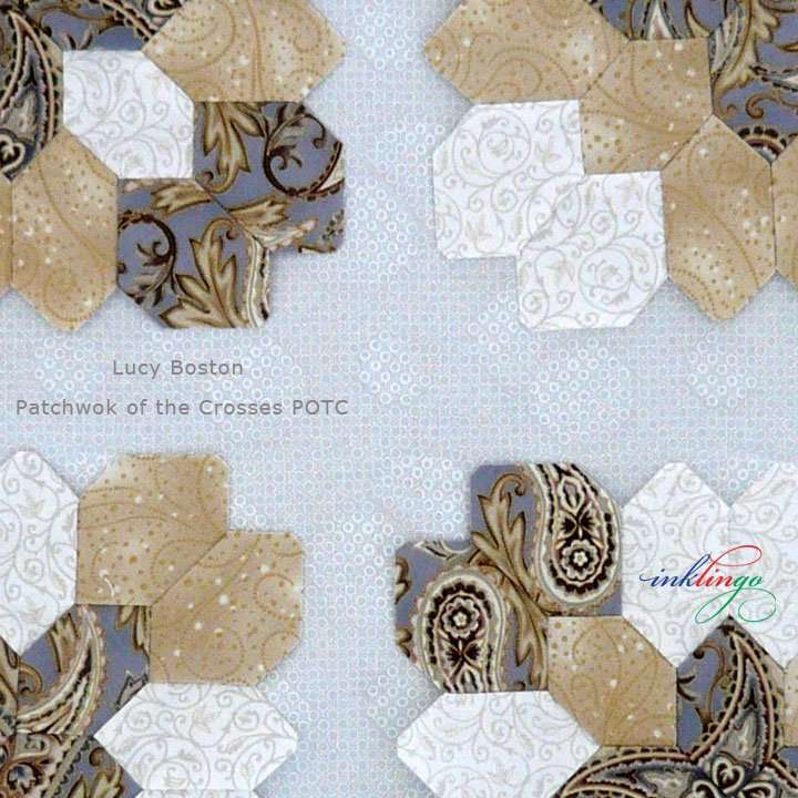
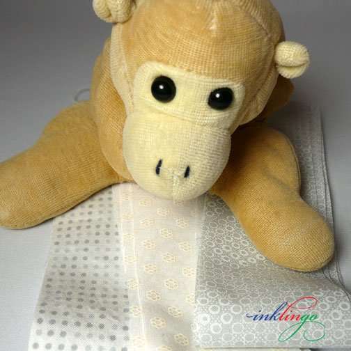
Yesterday I posted a photo on Facebook showing the fabric I found for the 24 hexagons around each POTC block.
There are 1558 of those “background” POTC hexagons, so this is a big decision!
I could hardly wait to wash the fabric and start sewing! I had already started calling it “Hemingford Grey” after Lucy Boston’s ancient manor house.
I think the color is good and I was hoping it would feel better after washing but it wrinkled badly and it is still stiff and paper-y. Now, I don’t know whether I really want to use it.
1558 is a lot of hexagons if you don’t enjoy the feel of the fabric in your hands and if the quilt will not feel soft and cuddly when it’s finished.
I love quilts that drape softly, and this fabric just won’t do that.
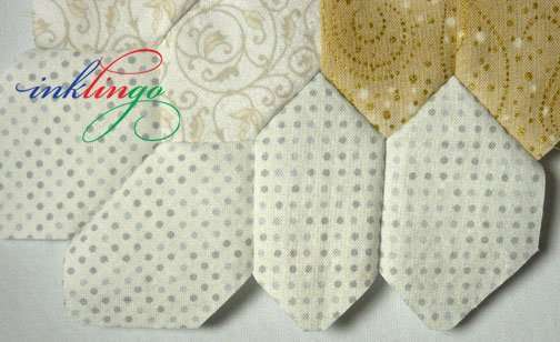
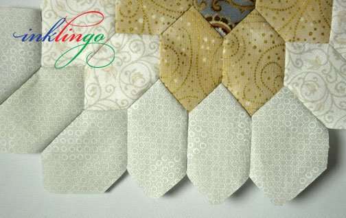
I tried another grey in my stash. It feels good.
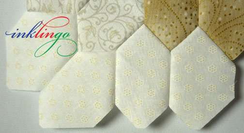
Then I tried this pale yellow flower on white. It feels fabulous.
Do I compromise on the feel because it is a good color? Do I use one of the others?
4 THINGS TO THINK ABOUT
While I was sewing, I had a few thoughts about my POTC blocks and Lucy Boston and Facebook.
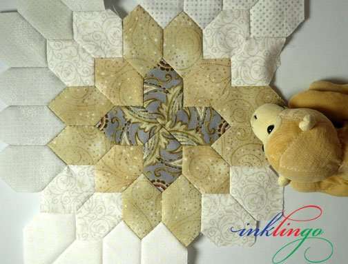
ONE Monkey and I think it is amazing that the ring of hexagons around the center is another 24 hexagons.
- 24 hexagons in the center.
- 24 hexagons around it.
- HALF of each “block” is the “sashing.”
TWO Lucy Boston did not have the luxury of finding “the perfect fabric.” The selection of cotton fabric available in the 1950s and 1960s in England was very limited.
In the whole history of the world, there has never been a better selection of quality fabric available than there is today. We don’t have to compromise.
Aren’t we lucky?
I’ll make a few more trips to friendly quilt shops, where I can feel the fabric before I make a decision.
(Click for larger view.)
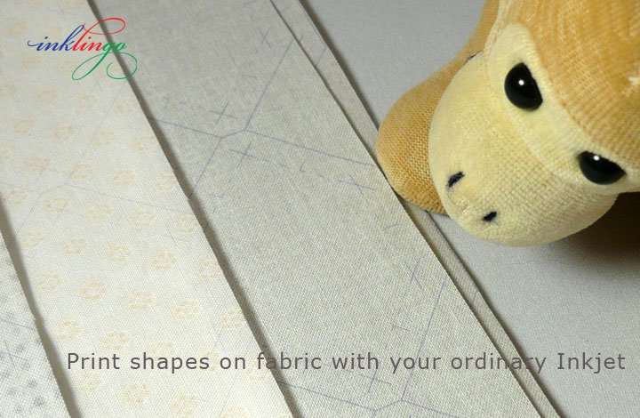
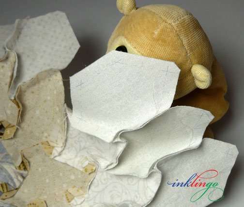
THREE Lucy Boston‘s only option was English Paper Piecing—slow, slow, slow. I was able to print three fabrics and sew my test hexagons in a matter of minutes.
It would have taken a lot longer to make a test like this with EPP. Would you skip the test and be disappointed later—or end up with a UFO?
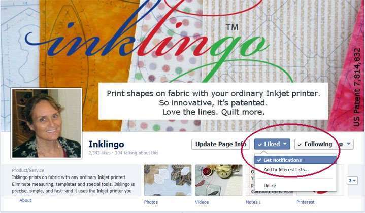
FOUR Electric Quilt taught me something about Facebook on their blog yesterday!
Facebook is trying to make small businesses like ours PAY so you will see what we post!
If you want to see what I share on the Inklingo Facebook page in your timeline, now you have to go back to the Inklingo FB page and separately click “Get Notifications” in the drop-down menu under the like button.
“Liking” the page is not enough anymore!
If quilters don’t choose “get notifications,” fewer and fewer will see my FB photos and that starts a downward spiral. If FB notices that what I post does not get comments and “likes” and “shares” then it reduces the number of people who see it.
On the other hand, the more “likes” and comments and “shares,” the more FB thinks I am posting something worthwhile, and the more quilters will see it—an upward spiral.
If you’re not seeing what you want to see on FB, this is probably the reason.
You can get in on the fun.

If you have a FB account, you can post your own photos (POTC? DWR? GFG?) or share mine on your timeline.
If you have any tips for using Facebook effectively, I would love to hear them!
ARE YOU SUBSCRIBED?
You can subscribe to the blog (top of right sidebar) to receive an email when there is something new.
Facebook is for fun and so more quilters hear about Inklingo but the blog is the best place for me to share tutorials and longer articles and the blog is searchable, so you can find many more articles of you type in Lucy, fussy, POTC, EPP or something else.
I can hardly wait to find the perfect fabric! In the meantime, I’ll keep sewing my fussy cut hexagons together, confident that my dream fabric is out there somewhere.
When I do find it, I’ll probably take a quick photo and get it on FB first, okay?
Thank you for visiting!
Linda & Monkey

New to Inklingo? Order and download free shapes and start sewing in the next few minutes. Quick Start (Always FREE.) There are triangles, diamonds, and squares in the free collection—great for dozens of different blocks.
$10 Coupon! 8 Year Anniversary Special on the handbook
25 Signs YOU are an Inklingo Quilter

Have you liked the Inklingo FB page yet? AND chosen “Get notifications?”
If you haven’t, please do. Thank you!
If the feel is wrong, don’t use it. That will take the joy right out of the whole project.
That technique where a pattern is “painted” on the surface flummoxes me. Stiffness is an integral part of the design so that you loose the soft warm homey feeling one imagines in a bed quilt. I find it especially common in “white on white” fabrics. For quilts, I just don’t get it.
I personally like the third choice–the yellow flowers. I think it brightens up the quilt. The first choice–the gray that feels stiff would be my second choice. The stiffness could be from the design on the fabric or the type of cotton fabric it is, (i.e., chintz). Chintz does not seem to soften. If the stiffness is in the design on the fabric and not the background, my experience is that is will not soften either. The background part would, but not the design element.
Re-reading your dilemma again, this thought popped into my head. Needing 1558 pieces, you must have several yards of fabric. Try washing it again (no detergent) with just a teaspoon of bleach in it. Sometimes that is just enough to soften up scratchy/stiff fabrics, and try to get it out of the dryer while it is still a little damp. I tend to go off and do something else and things over-dry. Then you can have your cake and Edith too.
You are right…you must love the way it feels….I have a UFO on my shelf right now that I have spent a bizillion hours on…and I don’t like the way it feels…so I am not likely to finish it.
I’m kinda leaning toward the pale yellow flower…. it compliments the tan in your cross. The second grey one appears too geometric/polka dotty (even thought I do LOVE polka dots…just not here….)
That’s my 2 cents worth!
I selected a sage green for my background… I love the darker contrast–it really brings out my colors… scrappy reproductions and whatever looks good. Might consider Jeanne’s idea (above)…a darker grey..
Happy Stitching!!
Susan in Garland, Texas
I like the first one you showed, the dark grey…it really seems to frame the block nicely. I also agree that it has to be something you like working with, it has to have a nice feel to it.
I like the gray, but I don’t think it has enough contrast. Of course, I haven’t seen your other fabrics. Have you considered a darker gray?
I’m with the majority; I like the first grey fabric best. I’m OK with the other two if you can’t find a similar, better feeling, grey.
With all the money Facebook is making it’s a shame they want small businesses to pay.
I love the gray with your colors. The softness and how it feels as you hand piece and then use is also important. I might have to find a softer gray at a local quilt shop. I plan on trying to get to my closest quilt shop, an hour away this weekend and put my hands on the fabric I want to use. Thanks for all the tips, off to facebook to make sure I get your updates.
Kathy
Definitely not the gray, either one. I am still undecided about the wee yellow flowers. But, I agree about the fabric feel.
It must feel nearly fabulous or will not be fun. Thanks for all your tips.
Your paisley is one of the most striking grey fabrics I’ve seen. I like the way the white with yellow brightens the block. (To me, grey has become overused. I wonder if in a few years it’s going to be one of those ‘what was I thinking’ dated color trends.) You have an extraordinary color sense so I’m sure you’ll find what makes your heart sing.
To me the feel of a primary fabric is as important as the color; if it’s an accent, ehhh, not so important. I would get tired of piecing fabric that didn’t nurture my sense of touch and in the end regret it. I like to pet my fabric/quilts 😉 .
The first gray you used has the best contrast, subtle but there. The others just fade away. Sorry it doesn’t feel good. Have been there and done that.
I love the value of the original gray. It seems to give your eyes a place to rest. The yellow is pretty, but it doesn’t have enough contrast between the block and the sashing. The feel and texture of a fabric is really important to me when hand piecing. These are just my thoughts. I know what you settle on will be beautiful!
I love the look of the original grey fabric as it really does frame your fabulous blocks nicely. Having said that, I am so glad you’re on the hunt for something that feels better as I know that the feel of that fabric is hugely important. When I was making my POTC quilt it was that sashing fabric that caused me to keep putting off working on it as it wasn’t an easy fabric to work with.
So I hope you find the perfect grey for your beautiful blocks. And I can’t wait to see what you’ve brought home for laundry! 😉
Linda, I do like the deeper grey but when you are hand piecing the feel is so important. I hope you find the perfect fabric.
Don’t like the grey trend myself but it does work nicely with the fabrics you are showing. I personally like the pale yellow flower fabric and if it is a bed quilt or throw then softness would be important to me.
Having said that I look forward to seeing what you and Monkey do next!
I like the one with the gray background in it. Love what you have done so far.
I definitely like the deeper gray…
Gray compliments the center and gray is the new neutral.
(replacing all the beiges of recent years.) This modernizes and is then… a good choice for a New Modern Quilt Look…
I expect you will then have an up-to-date sashing neutral (Gray) to compliment all the rest of the crosses you plan to add for this project….
love it !
ah good to know!